Editorial, the weight of neutrality
Helvetica
Two spreads about the most used typeface in the world, where Helvetica itself becomes the article's argument.
- Role
- Editorial layout
- Context
- Academic project · UFRJ
- Year
- 2022
- Tools
- Photoshop, InDesign
The problem
Helvetica divides designers. For some, the lack of ornament is sophistication. For others, it is sameness. A feature about it cannot sit on the fence.
The brief
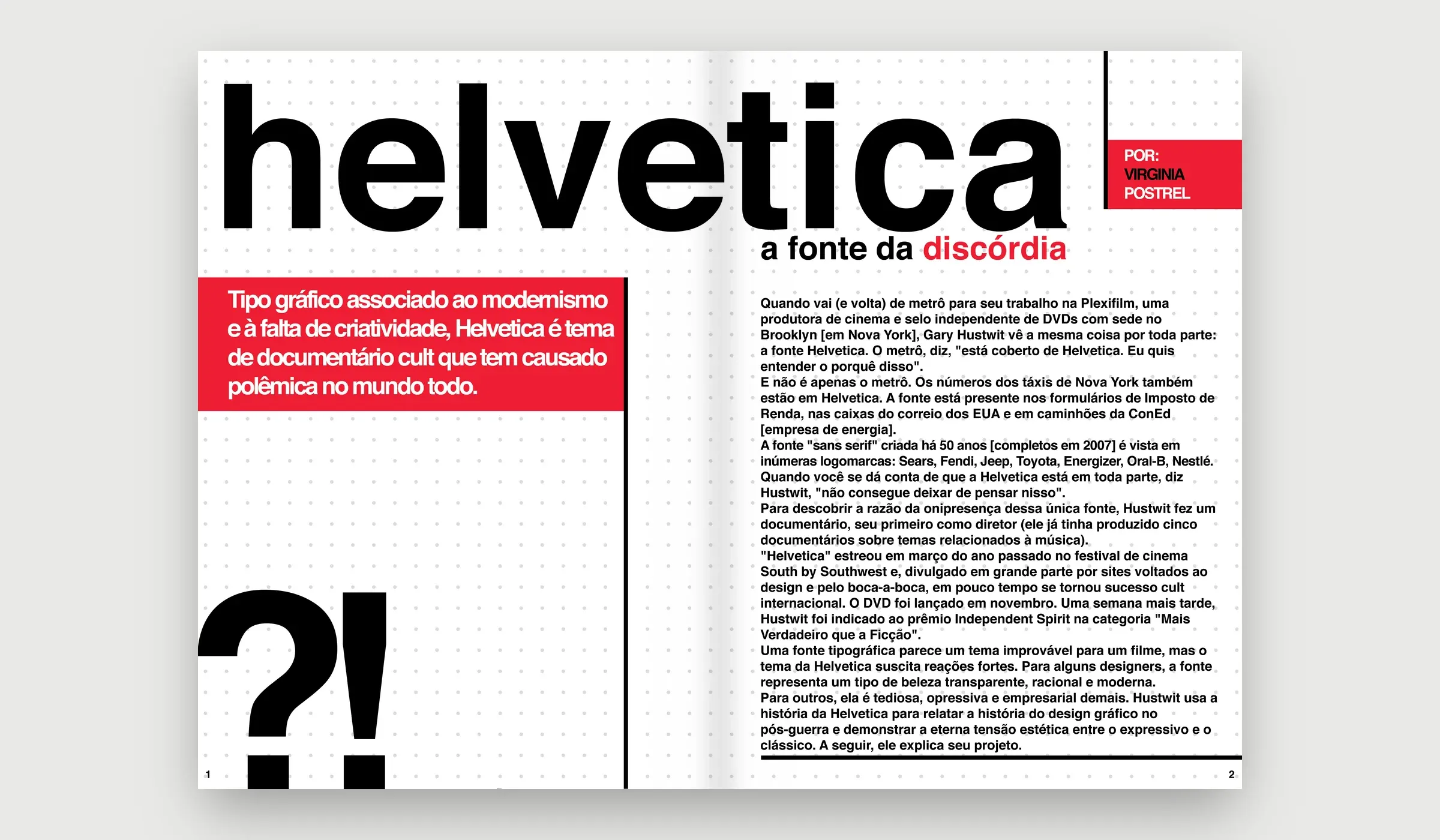
A magazine article about typography, based on an interview by Virginia Postrel with Gary Hustwit, director of the documentary Helvetica. The audience is professionals, students and people interested in art, design and film.
The article
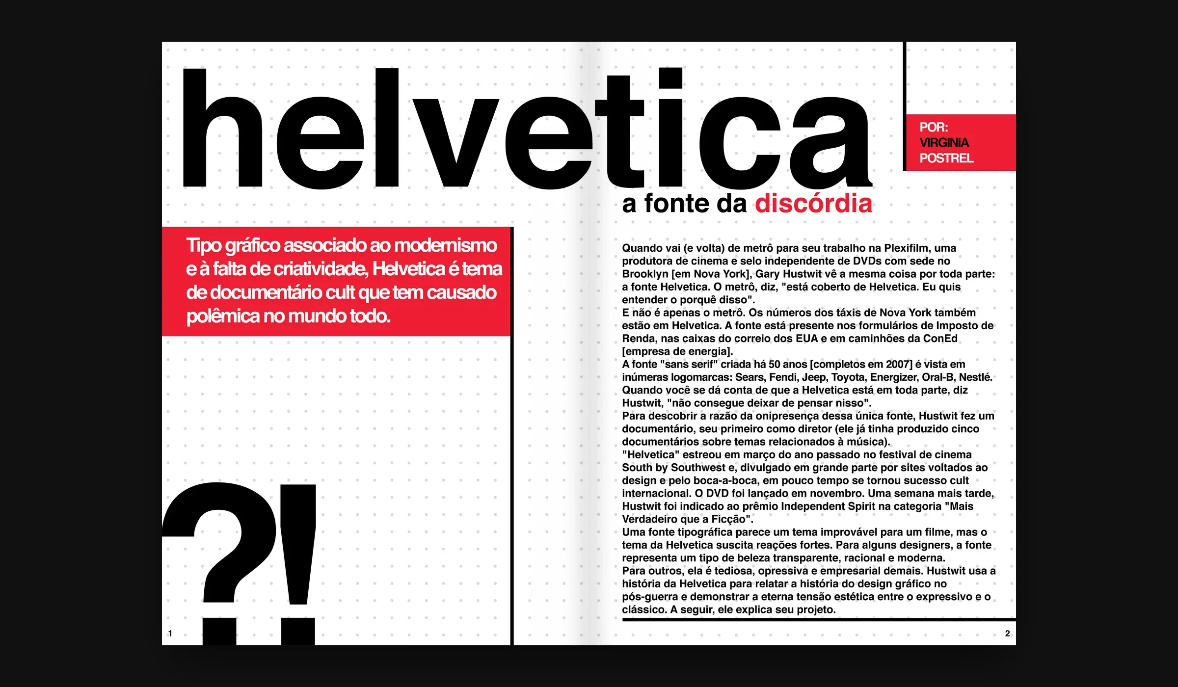
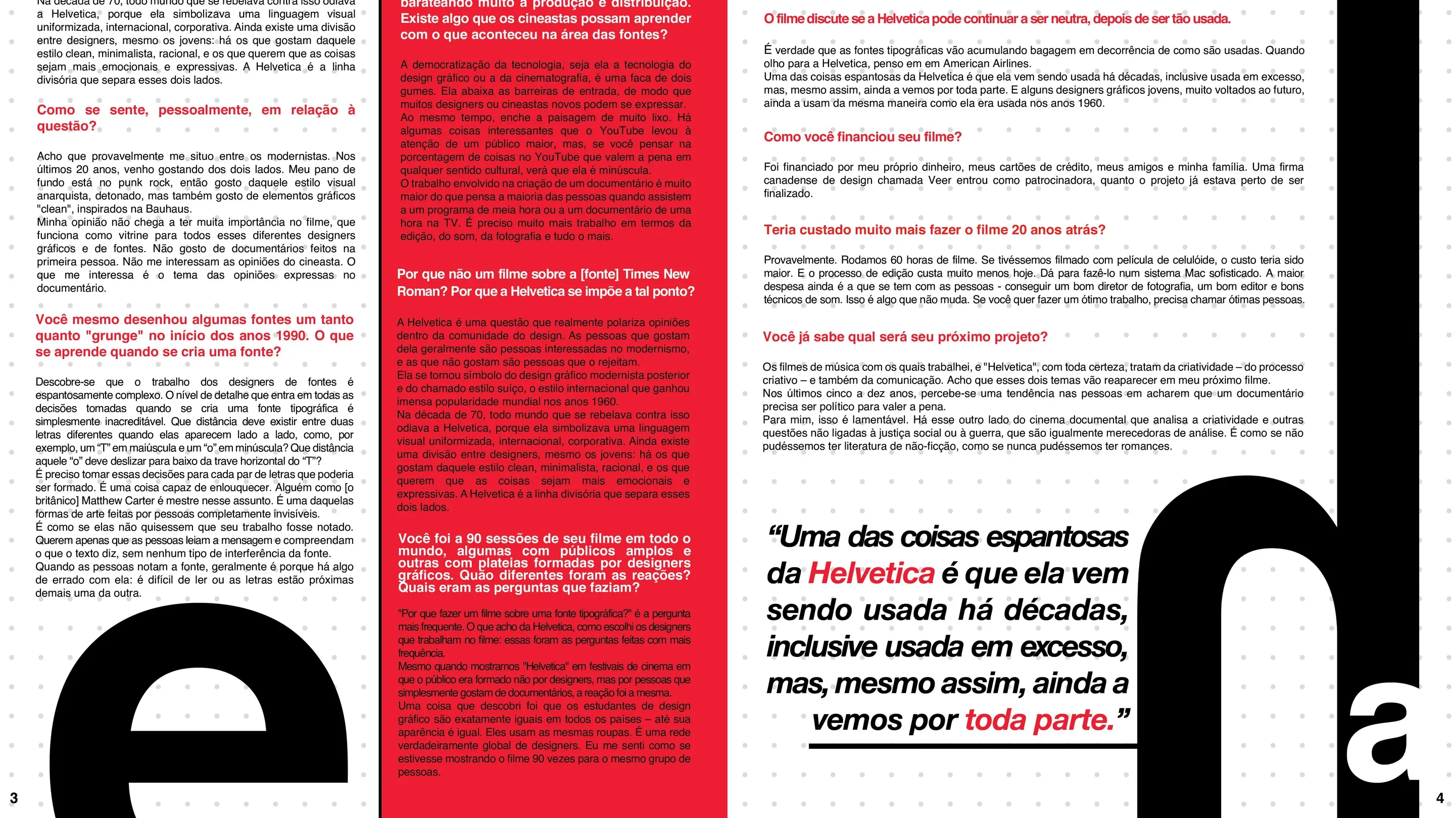
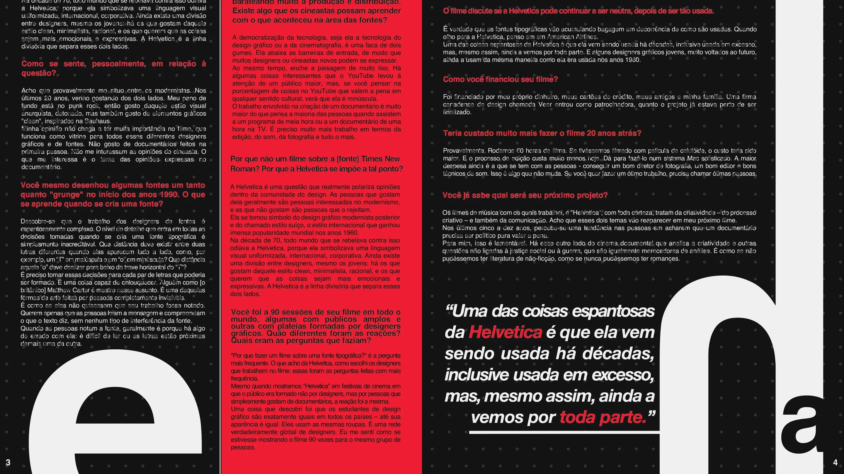
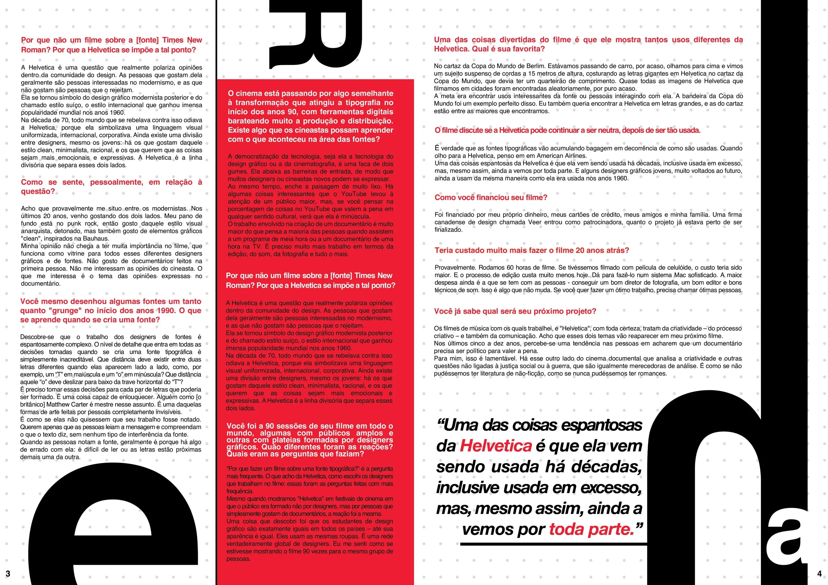
Two spreads, four pages. Click a page to turn it and switch on the grid to see the guides from the original file.
How the opening spread comes together
- 01
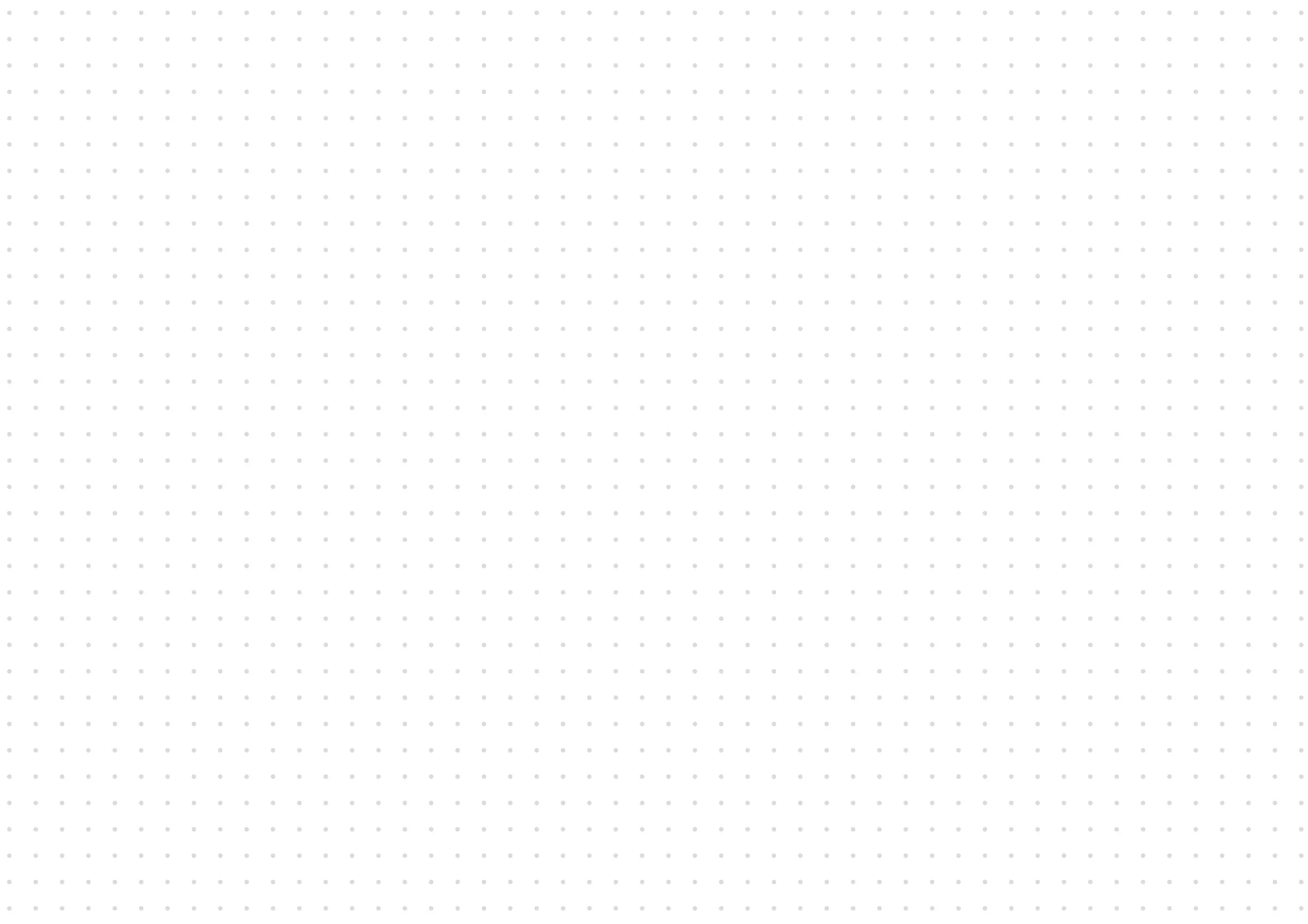
The grid
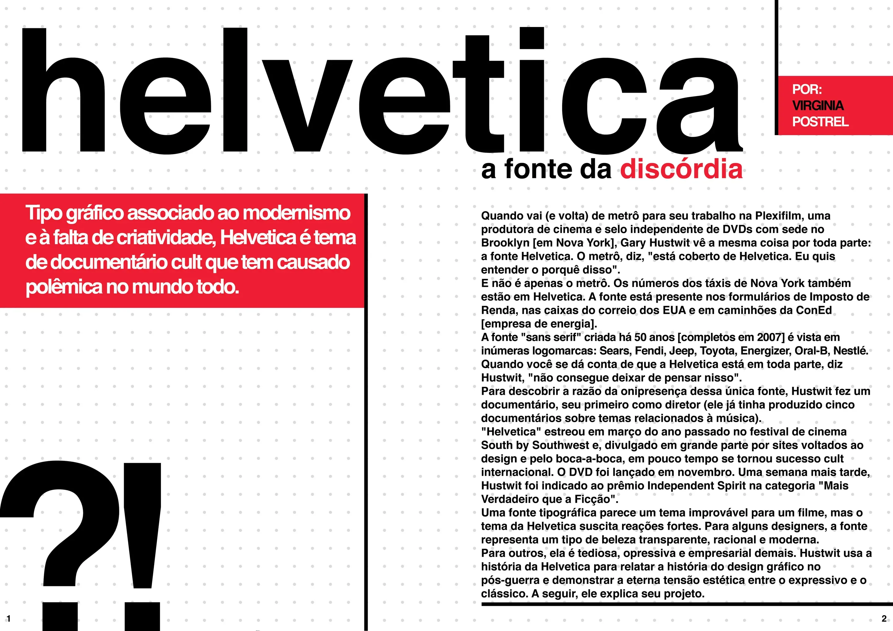
Margins, the fold in the middle and the text columns. Everything that follows leans on these guides.
- 02
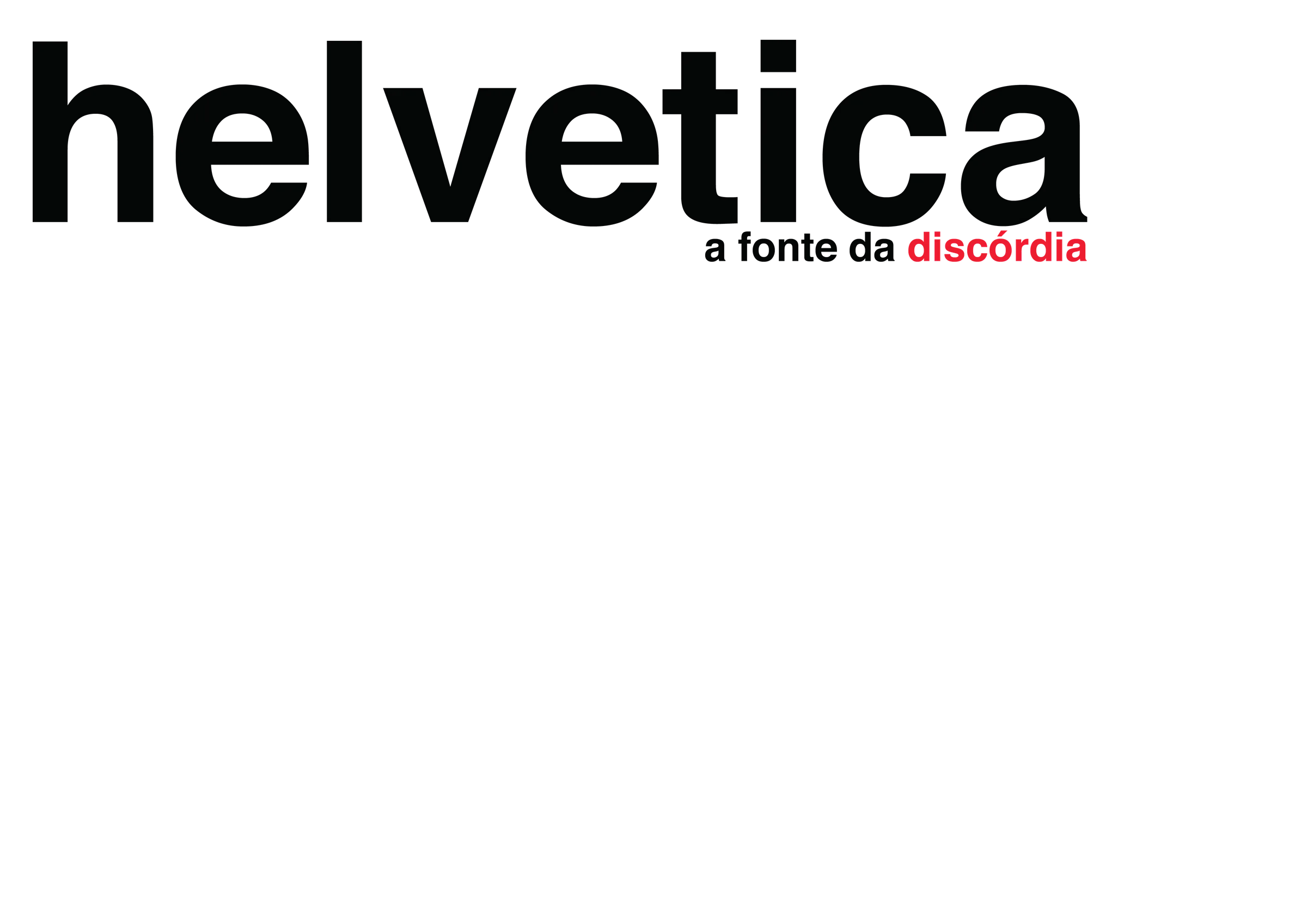
The title
In lowercase and big enough to cross the fold. Right below, a fonte da discórdia, with the discord in red.
- 03
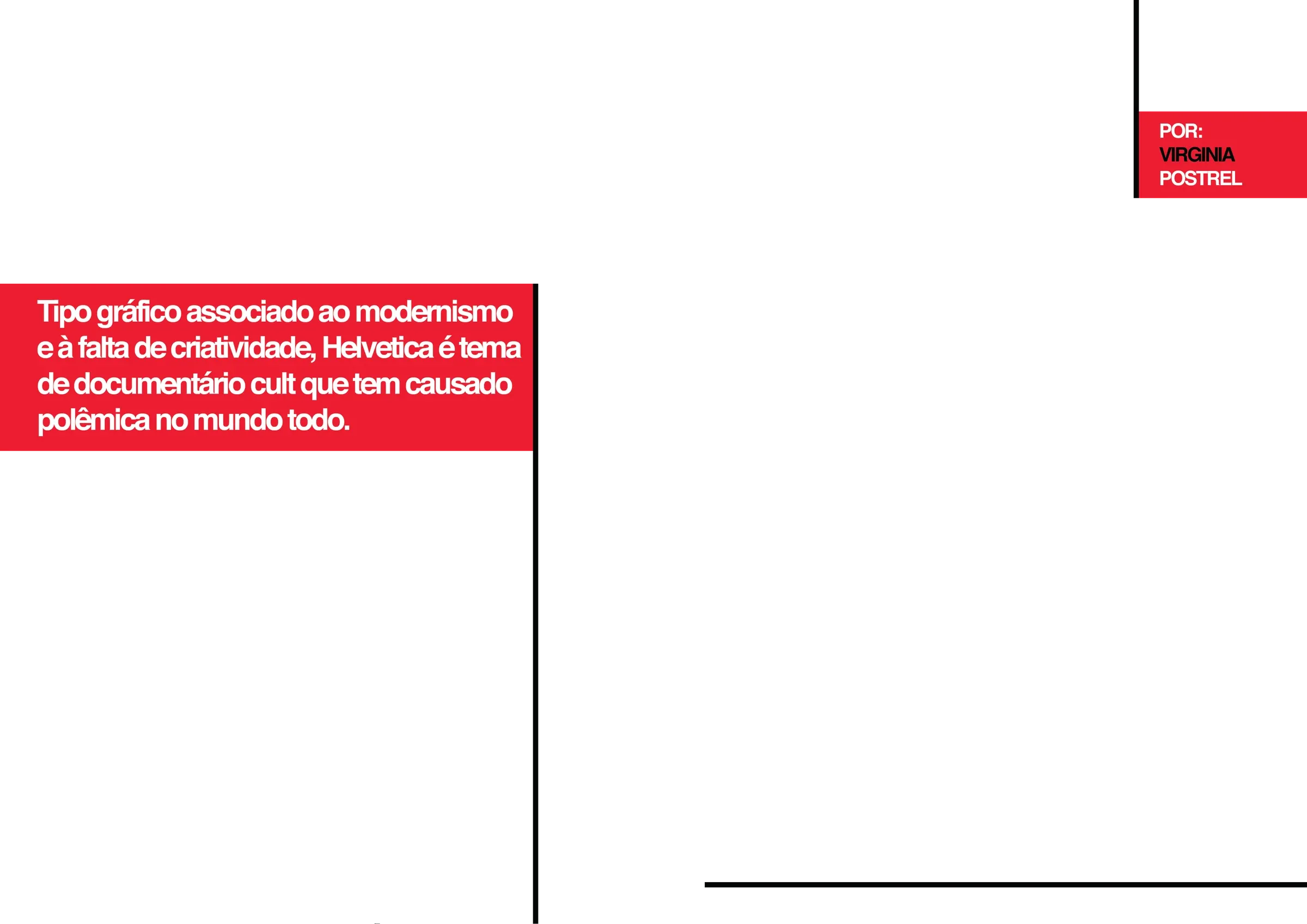
The red
Red blocks and black lines divide the page. The standfirst and the byline go in the red.
- 04
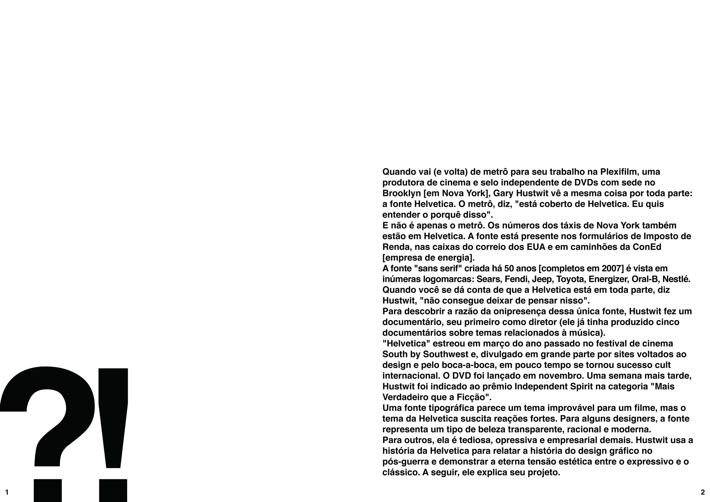
The text and the ?!
The body text sits on the right page. On the left, a giant ?! runs off the edge and sums up the controversy.
Three versions to the final one
The first opened with a catalogue of Helvetica Neue weights. The second swapped the catalogue for the ?! and turned a whole inside column red. In the final one, the text got bigger and the giant letters started being cut by the edge.
Red, white and black
The colors of the Swiss flag, where the typeface was born. The red is a little less bright than pure red, so it is easier on the eyes.
All in Helvetica
Regular, Bold and Bold Italic, and nothing else. The typeface was in the brief and would have made sense anyway, in a feature about it. References came from Herman Miller, Braun and the MKBHD channel.
The decision
Helvetica is both the page's system and its image. The giant letters, cut by the margin, make the layout take a side in the debate the interview describes.
9 images in this project See the full gallery →